 by
by By: Jenna Lyons
A brand’s social media presence is good when it looks pretty, but its great when there is a strong visual brand identity. This is all about creating a consistent, recognizable style that communicates your values, connects with your audience, and helps your content stand out. Whether you’re a student, young professional, or aspiring designer, understanding how to build and apply a visual identity is essential in today’s social media landscape.
From my own experience with class projects and freelance design work, I’ve realized that intentional visuals make all the difference. Here’s how to approach visual brand identity and why it matters.
Why Visual Brand Identity Matters
Your visual identity is the “face” of your brand online. A cohesive identity builds recognition so that your followers immediately recognize your content in crowded feeds and communicates your brand’s personality. These consistent visuals make you look professional and trustworthy. It guides creative decisions and ensures all posts align with your brand goals.
When I first started freelance work on a website and socials for a small business, the business only had a logo, and not much of a brand identity, color palette, fonts, etc. Once I developed a cohesive color palette and font scheme, even though it may seem like small details, the content overall looked much more professional and cohesive, resulting in more engagement.
Define Your Mood and Style
Start by identifying the tone of your brand. Ask yourself:
- What emotions should my visuals evoke?
- Is the style playful, minimal, bold, elegant?
- What aesthetics align with my audience?
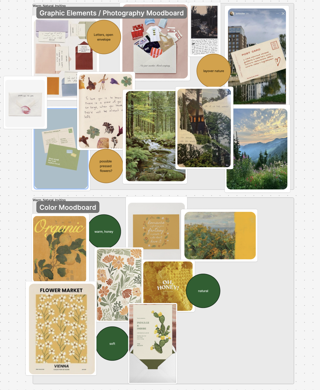
I like to create a mood board on Figma, using Pinterest primarily to find content to add to it. These can also be created just using Pinterest directly or other tools like Canva. Include images, colors, and typography that capture your vision. I did this for a campaign last term, and having a visual reference made designing each post so much easier. Figma is a great tool to have everything laid out for you on one document, and make it easier to digest.
Choose Colors and Fonts Strategically
Consistency is key.
Colors: Pick 3-4 main colors and stick to them across posts. Colors evoke emotions and influence perception, so choose ones that align with your brand’s personality. In my case, the brand I worked with already had a logo, so I used a color selector to pull colors from their logo to use as the brand’s main colors.
Fonts: Select one for headers and one for body text. Consistent typography improves readability and reinforces style. Tools like What Font Is are great for finding fonts that you may want to pull from your moodboards or logo.
Use Layouts and Templates Intentionally
Templates help maintain a consistent structure across posts. And can save time when needing frequent posts. Design 3–5 reusable layouts for Instagram, Reels covers, or carousels. Canva is a great tool for this.
Adjust content to ensure variety, but keep the structure consistent to strengthen recognition.
Maintain a Consistent Photo and Graphic Style
Decide how your photos and graphics will look. Think about lighting, tone, and composition for photography. If photography is supplied for you, as it has been in my case, I like to surround photography with graphics that will match the color scheme or keep a consistent editing style.
A consistent visual style signals professionalism and makes your feed memorable. On tools such as Canva, you can easily save graphics to be reused later.
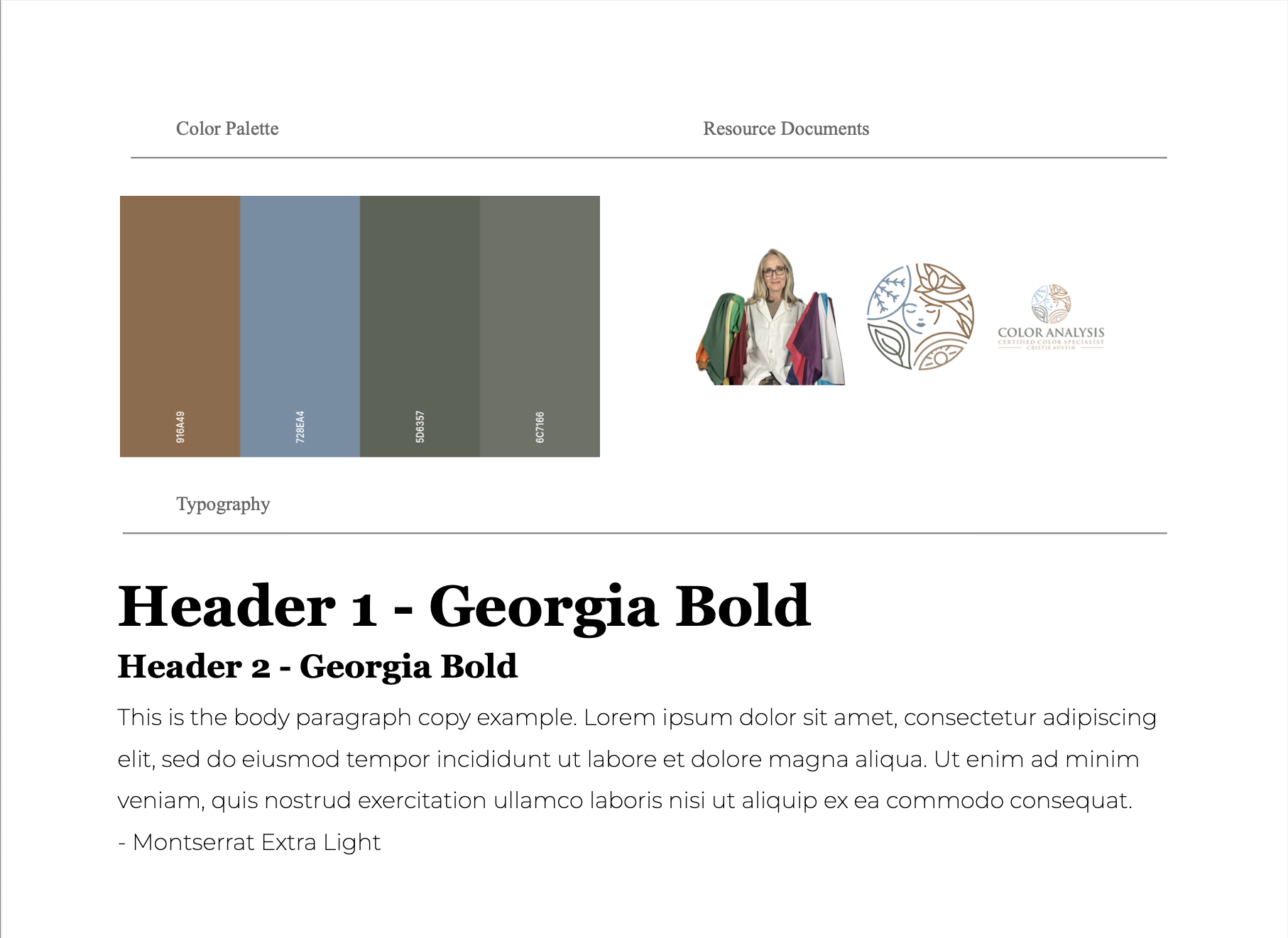
Build a Style Sheet
This encapsulates your entire brand and may be the most important piece to keeping things consistent, especially if you are not the only one working on content.
A Style sheet documents your:
- Color palette – show the colors with hex #’s
- Fonts
- Logo variations
- Templates
- Mood board or visual references
After putting this on one sheet, if you use Canva, I recommend uploading these things in there as a brand kit, as this will make the design on Canva move faster and easier to make sure everything fits your brand.
A guide keeps your work consistent, saves time, and makes collaboration easier. Having all of these pieces for design in one place will help your brand/client and you as a designer in the long run.
Apply Your Identity Consistently and Evolve
Your visual identity should guide every piece of content. Consistency helps your audience recognize your brand, but your style can evolve over time as trends, goals, or your personal style change.
A strong visual identity is about intentional, consistent choices that communicate your brand personality and values. From class projects to freelance work, the brands that stick out are the ones with visuals that are immediately recognizable and cohesive, and I believe these tips are a great starting point for someone getting into digital design for a brand.
Find me on other socials!


This is such a clear and practical breakdown of visual brand identity. I love how you connect the theory to your real project experience. The example about working with a small business really shows how even “small” details like colors and fonts can completely elevate a brand’s professionalism and engagement. I also appreciate how you emphasize tools students actually use (Figma, Canva, Pinterest), because it makes the process feel accessible rather than overwhelming. Overall, this is a super helpful guide for anyone trying to make their social media presence look intentional and truly reflective of their brand.
As somebody who has worked in social media a little bit, I find this very helpful. Many times I have found myself caught up in aesthetics (which is important, don’t get me wrong) but it is at least equally as important to stay consistent with branding and visuals. Utilizing and developing a brand kit can be especially helpful when developing your content calendar.
I thought your response of this was great! It makes aethetics seem much more possible. I love that you added your own examples especially those from your independent work, it helped show the need of consistency. The advice about style sheets and mood boards was also very helpful.
Hi Jenna! I really enjoyed your post — you explained visual brand identity in such a clear and approachable way. I liked how you connected it to your own freelance experience, because it really showed how small choices like colors and fonts can completely transform a brand’s look. Your tips about mood boards and style sheets were super helpful too, especially for people just starting out in design. This made the whole idea of building a cohesive visual identity feel way less intimidating.