By Marisa Cesare (@marisajocesare) and Brianna Martin (@sojcbri)
In class on Wednesday, (our last J 480 class ever) Kelli (@kmatthews) tried to liven up dead week a little by giving us some good tips and hacks for improving our social media and some tips for iphone photography. This livened up the class and the usual GIF frenzy began, we even talked about some tips we found on sites like Mobile Mob.
Kelli started the discussion by stressing the use of original photography to tell a story, an idea that clearly stuck with the class. We then went on to talk about the importance of having visual content in the majority of your social media posts. Posts with images get 94% more views than posts without. So when in doubt, be sure to add a picture!
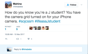
From there we shifted toward basic photography principles, the first being the Rule of Thirds and how the iPhone camera grid can be a huge help. Use the grid, love the grid.
We also touched on some lighting tips. Basically find the light and use it to the best of your ability; your photos will come out sharper and less grainy. Just say no to the flash. It won’t make your photos come out any better.
The background is another thing to consider, especially if you’re taking a close-up photo of something you’re eating or a product sponsorship for Instagram. Most professional photographers use things like product photo backdrops rather than their own tables, but you can make your own temporary backgrounds as well. Make a clean corner with a wall and a base, put down a drape or cloth if you need color.
Think about the clutter as, will it draw attention away from the focus of the photo? Don’t leave anything in the photo that will make people ask the wrong questions either. You want them asking about the focus of the shot, not a show you’re watching on the TV. Though if you want the photo to breathe life then having a neat and sterile background in your shot can be a detriment, instead add plants and a reasonable amount of clutter to make the place seem “lived-in”.
Kelli then started a discussion on editing apps. The overwhelming class favorite was VSCO. It has great filter options and a variety of other editing tools. After going over these “iphoneography” tips, Kelli surprised the class with a photography scavenger hunt to try out our new skills.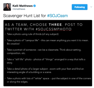
Some of our classmates took some pretty sweet photos. We started a new hashtag to look over those: #sojssmphotos. From there, Kelli exposed all of her social media secrets to the class. Essentially, make sure you’re tapping into trends going on in the world, and utilize a content calendar. Planning your content saves yourself so much time, energy, and creativity.
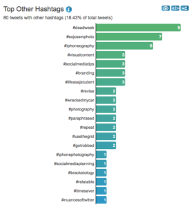
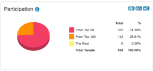
Twitter Analytics 3/15/17:



I definitely found this class an interesting one! I do some freelance photography on the side and its amazing that with just these few basic tips you can take an amateurish looking photo and make it look professional. With Social Media being the way it today there is a fight to make sure everyone has the best content and with that the best pictures. These tips will help us all step our game up!
Great post! I enjoyed this lecture because Kelli shed light on the art of iPhoneography. It is so easy to tell when a photo was taken by a camera phone. What is less clear however, is what exactly it takes to compose a good cell phone snapshot. This lecture gave our class a sneak peak behind the iPhone lens into what makes a visually appealing photo right at our fingertips.
Thanks for providing a great overview on this class. I consider myself somewhat of a photography novice and always get frustrated when I can’t get my iPhone photography to look like my friends do!
I think this is definitely an area where small businesses and lesser developed social media accounts struggle, quality content is so important, anything that looks remotely amateur can really hurt the credibility of an organization. Businesses with limited resources are often forced to resort to iPhone photography so these tips could really help them create great content.